Logos and branding
I can create a professional company identity and branded assets for your digital marketing, printed materials, stationery, signage, and vehicle graphics.
Japanese Prints
Bristol Museum & Art Gallery
This exhibition showcased a Western collection, so I reflected this by modifiying and updating a 19th Century Egyptian-style font originally designed for letterpress (a similar pressure-printing method to woodblock) around the same time as the prints were made, and gave it a delicate typographic treatment to mimic precise brush lines.
Fabric Africa
Bristol Museum & Art Gallery
Early development of elegantly kerned serif type began to sit at odds with the beautifully vibrant patterns and prints within the exibition. A bold sans-serif typeface with strong presence was chosen for balance. The dark grey, white and red colours were the most common colours in the fabric collections, and were used throughout the interiors of the exhibition. See exhibition page for further details).
Dead Man's Sandwiches
A logo for a pub league dart's team that tended to play after a wake, and were paid in leftovers.
View projectMake Blaise Museum Brilliant
Blaise Castle & Museum
Blaise Castle & Museum is set within many acres of fields and woodland on top of a steep hill high above Bristol. I created a graduated colour scheme to mirror the sun rising over the hill. These colours were also brought into the interior design of the house and exhibition (see exhibition page for further details).
View projectBristol is Open
Incredibly intricate gradient colours hint at the complexity of this cutting-edge data initiative.
View projectFairytales series
Overlook Films
Created for a film production company's series of short films, which took traditional fairytales and reimagined them for a modern audience.
View projectWheels to Work
South Gloucestershire Council
A logo for an initiative to help jobseekers travel to interviews via donated bicycles.
View projectThe Sound of Salvation
Logo for a record label that originally specialised in reissuing (and thus salvaging) long-lost psychedelic folk albums from the distant past, bringing them to a new audience.
View projectThe Levels
Overlook Films
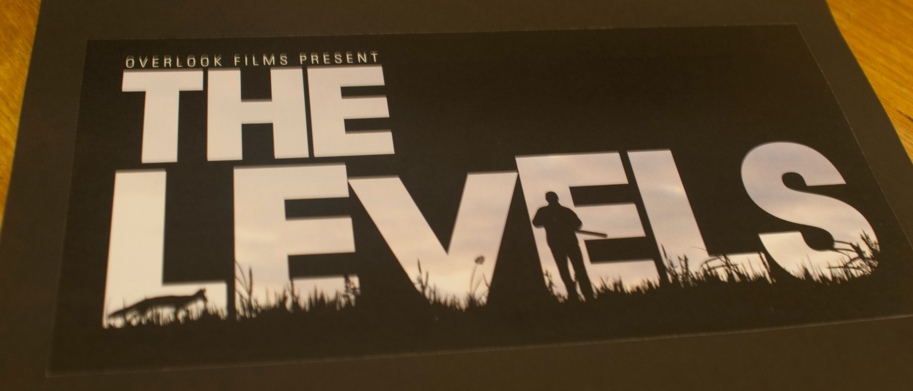
A logo which doubles as a full-screen silhouette for a violent, romantic, rural thriller film set in the Somerset Levels in the West Country. The logo had to convey menace, isolation, and the countryside. See Overlook Films for further details.
View projectBristol Walking Festival
Logo for an annual month-long festival celebrating local walks, which aims to encourage to get more people of all ages and abilities active.
View projectLet's get Mashed!
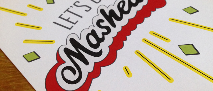
An intro splash screen ident for an NHS-funded, animated public information film on the dangers of legal highs. I produced the illustrations for the entire film. See Let's Get Mashed! for futher details.
View projectAutorefurb Ltd
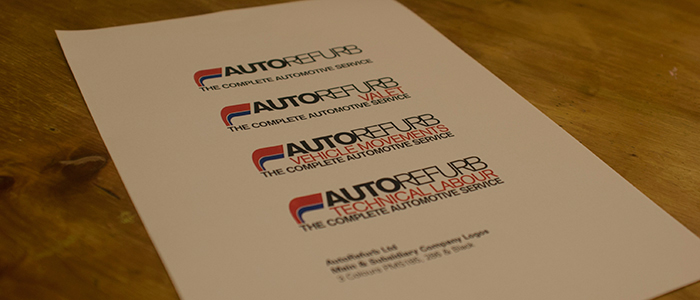
A set of identities for an umbrella company and subsidiary automotive service businesses.
View project