Design and layout
I have an enormous amount of experience in print and digital design – from annual reports, bid documents, and large campaigns through to flyers and leaflets for sole traders. I can add a polished edge to help you stand out from the crowd.
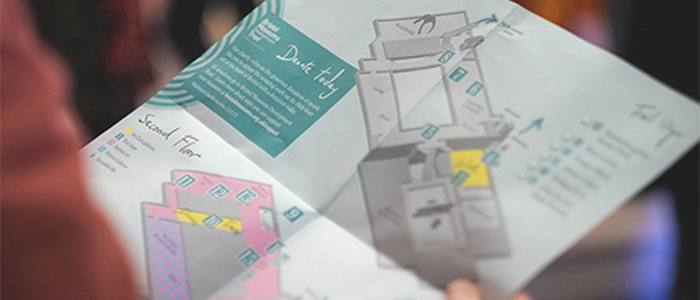
Venue guide and museum map
Grayson Perry / Channel 4 / Swan Films / UWE / Bristol Museum and Art Gallery
Exhibition information leaflet and wayfinding map for Grayson's Art Club series two.
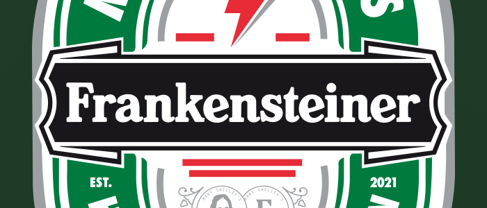
In-house beer brand
Mary Shelley's House of Frankenstein
Parody beer identity which may potentially become an in-house beer brand for Phase II of the museum opening.
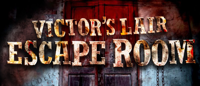
Escape Room identity
Mary Shelley's House of Frankenstein
Identity, wall graphics and social media assets for a stand-alone attraction located on the top floor of Mary Shelly's House of Frankenstein museum.
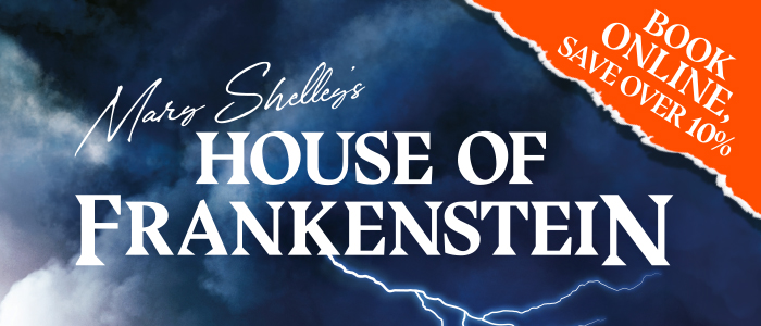
Print marketing
Mary Shelley's House of Frankenstein
Various printed marketing items using a custom spot U.V. ink.
Venue guide and museum map
Bristol Photo Festival
Large fold-out venue guide with an integral trail map.
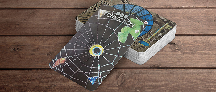
Dare to Dream
Oracle card deck
53 card Oracle deck with custom type and icons. Each card uses a handmade dream-like collage with thematic imagery and colour linked to the card title.
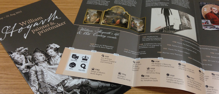
ViewWilliam Hogarth
'Painter and printmaker' exhibition
Graphics and signage for a touring exhibition of William Hogarth's oil paintings and prints, at Bristol Museum and Art Gallery. Item description plaques, door and window vinyl, various text panels and wall panels were produced in addition to a wide array of leaflets, flyers, postcards and advertising (both digital and traditional print) media.
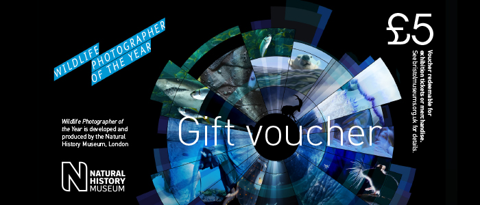
Wildlife Photographer of the Year
Natural History Museum
Great images of nature transform the way people look at the natural world, challenge opinion and stimulate debate. I have produced the Bristol leg of the touring exhibition for several years.
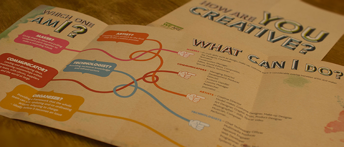
'How are you creative?' leaflet
Bristol Temple Quarter Enterprise Zone
Gatefold "career map" leaflet to encourage young people to pursue creative sector careers in one of the many companies based in Bristol's Temple Quarter enterprise zone. Featured project on Hype for Type.
A6 Postcards
Sport England / This Girl Can
This Girl Can is a Lottery-funded initiative aimed at getting more women active through boosting confidence and enabling. I created a range of marketing and promotional materials including a website with events listings and a suite of digital assets.
BP Screenings
Royal Opera House
Large format television screen adverts for public screenings of Royal Opera House performances, sponsored by BP.
'What are the creative industries?' leaflet
Bristol Temple Quarter Enterprise Zone
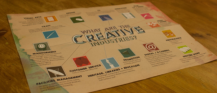
8pp A5 leaflet which used eye-catching colours and a strong, non-corporate look. It folds out to introduce school leavers to creative sector careers, which is a huge area of growth in Bristol's regenerated enterprise zone.
Guidance reports and case studies
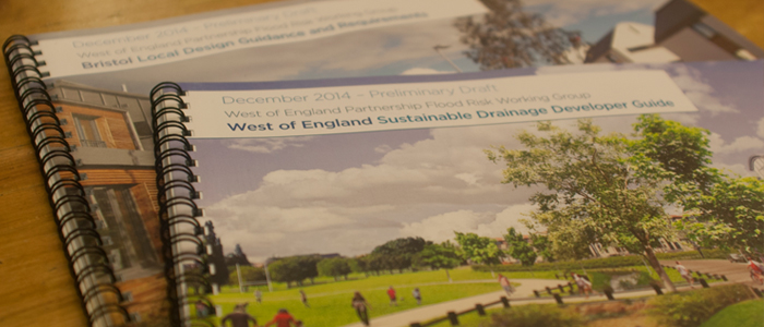
West of England Sustainable Drainage
Following on from the success of the Flood Risk report, I was commissioned alongside ARUP to produce sustainable drainage guidance, developer guides, and regional case studies for Bath & North East Somerset Council, Bristol City Council, Somerset County Council, South Gloucestershire Council, North Somerset Council.
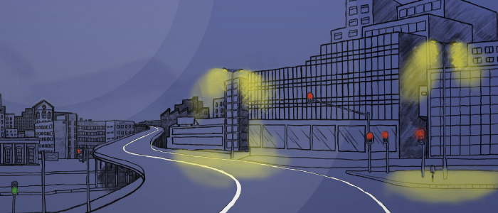
TVCQJVD 7"
Aquaserge
A-side urban scene artwork for a 7" record release. This cover was for a split release coupled with the artwork below, each side mirroring the shapes of the landscape and curvature of the road.
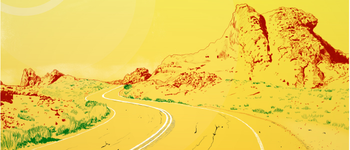
ViewVirage Sud 7"
Aquaserge
B-side desert scene artwork for a 7" record release. This side captures the more rural frontier-like feel of the environment which is reflected in the wild-west echoes of the music.
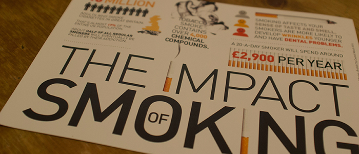
ViewImpact of Smoking infographic flyer
NHS Bristol
2pp A5 flyer showing smoking-related NHS and public research data displayed as infographics.
Promotional Postcards
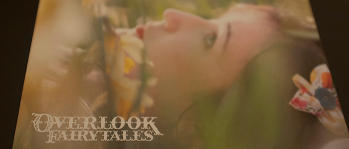
Overlook Films
Postcards to promote a DVD release of a series of short films. The stories themselves are quirky ‘what if’ versions of Cinderella, Little Red Riding Hood, and Snow White and the Seven Dwarfs.
Promotional and advertising items
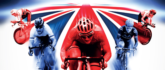
Tour of Britain
I was responsible for creating roller banners, posters, canvas banners and online advertising leading up to the event, for the leg of The Tour of Britain that started in Worcester and finished in Bristol.
View projectDental Practice Magazine
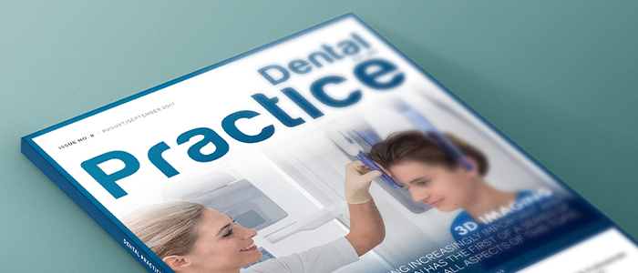
KV Media
Creative direction, layout and typesetting for a 100+ page dental magazine, published ten times a year. I also designed many of the advertisments inside for clients.
Exhibition marketing materials
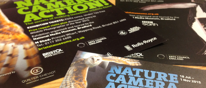
Nature Camera Action!
An exhibition on wildlife photography in association with the National Media Museum and the BBC Nautral History Unit. Outdoor fabric banners, Contra Vision window graphics, wall graphics, printed cut vinyl animals, posters, large format LCD screens, and regional advertising were among the many marketing items produced to conincide with the exhibition.
Active Travel to Schools
Local Sustainable Transport Fund
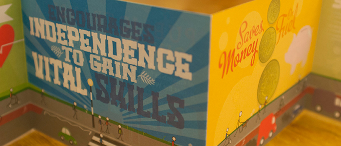
A 12-page concertina-fold leaflet with hard cover, extolling the virtues of travelling actively to school using fun and colourful typpography and illustrations. A 20,000 print run was distributed to all participating schools in the south west of the country.
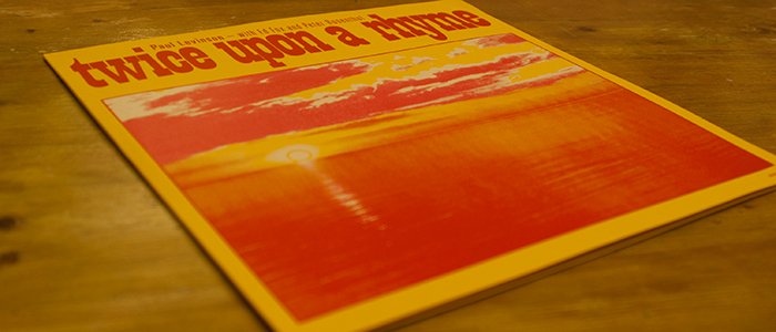
Twice Upon a Rhyme LP covers
Sound of Salvation
A long-lost psychedelic rock album reissued as a run of 250 copies few years back. A second pressing run was arranged, with limited edition cover artwork and heavyweight screenprinted textured card. For the label artwork I tapped into the early 1970's zeitgeist of mystical design trends.
Flood Risk Management report
UK Central Government
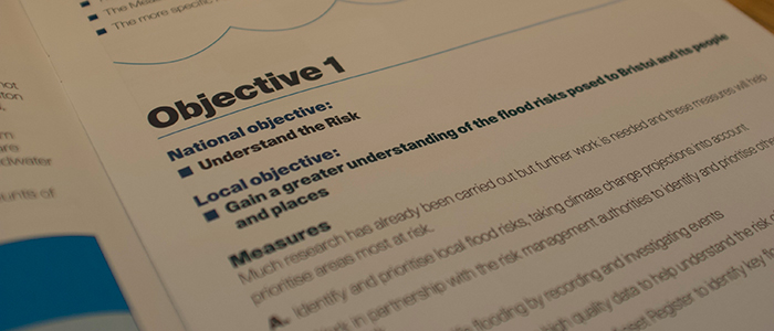
A multi-million pound funding bid to maintain tidal, fluvial and surface flood defences required an immense amount of typesetting, cartography and data visualisation over several months. The report was praised for it's clarity and so well received by Central Government that the design became used as the national local government standard.
